
CLIENT
BECU
The Team
Myself, UI Design
Monica, Sr Director, Digital Marketing Operations Practice
Kerry, Developer
Timeline
May - June 2019
My Deliverables
Visual assets and design spec of a set of dynamic content blocks used in BECU customer onboarding emails
How Might We Make Customer Onboarding More Dynamic?

BECU’s customer onboading emails are a platform for the company to engage with its customers in a simple but effective way in order to empower those customers to use the financial services available to them through the credit union. The previous email graphic contained this status wheel as a way to present the most popular and useful information to a customer in their email, but BECU decided it was not the best solution with this goal in mind.
Keep it Simple

By keeping the same basic structure but clarifying and expanding on each section of content, all the information and tools previously available are still presented, but in a way that is more intuitive and tailored to each customer, and easier to understand what actions the customer can take right from their email. The focus is more on what an individual user can do from here and quickly, and showing that to the user in a personalized and understandable way, rather than trying to fit every action into a one-size-fits-all email template.
Insights
When I first took on this project, I knew very little about it other than a) the client company was BECU and b) they wanted to redesign their customer onboarding email graphic in a way that was easy to read, easily made dynamic, and clickable. I received an image of their example onboarding email with the current graphic in it and was tasked with creating an updated design, but I wasn’t given any direction on specifics. I also was sent a document containing the BECU digital style guidelines so I would have their font and color branding.
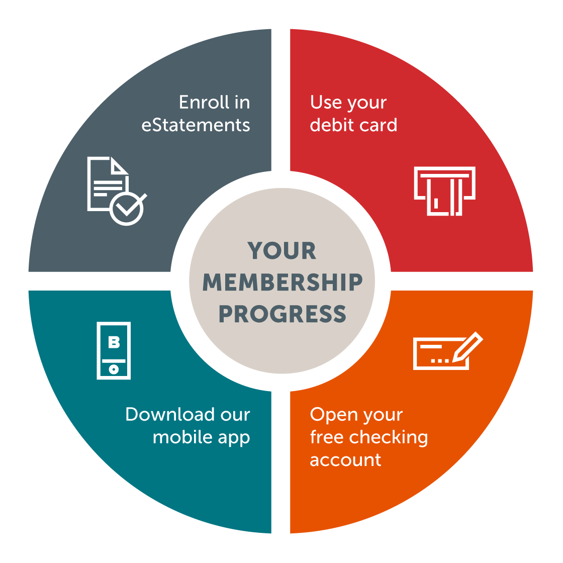
This is the original onboarding graphic that previously appeared in BECU customer emails.
I like to take a quick and iterative approach in my design process. I think this approach works well in general but it especially did in this case because of the relatively hands-off approach from the client. Since I knew they weren’t asking me for any wide-ranging change to the company’s branding, but to focus only one graphic used in their email campaigns, I decided to start small and see how receptive the stakeholders were to new changes to the design. I started sketching small differences in the shapes of their current graphic, and ended up with a few relatively similar sketches to start with, along with some taking different directions.
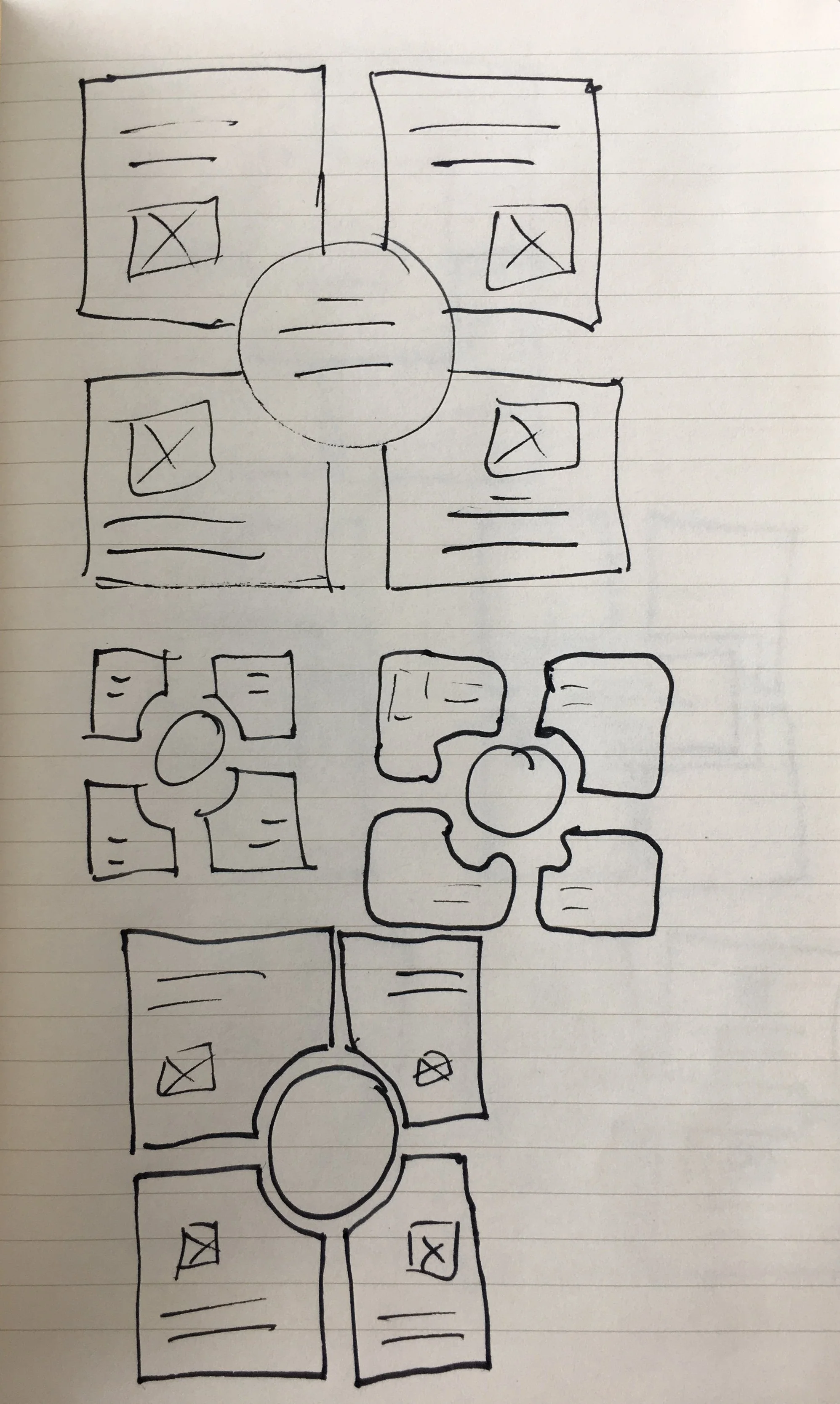


Using these sketches as a base, I drew up the shapes as wireframes in Adobe XD to be able to export and quickly share edits and updates with the stakeholders. I added in the company branding colors and fonts in a few different configurations, and sent a batch of initial visuals for the first round of feedback so I would know what direction to take for my next iterations.
Desktop Proposals


Mobile Proposals


Ideation
I think what worked well for my first few design sketches and wireframes was the combination of using a familiar design while still incorporating some new directions the graphic could take. The feedback I received from the stakeholders about this first set I sent for review was that they were interested in seeing a new look for the onboarding graphic. One area I could most likely improve on in the future is to be on the same page about whether to try new things or stick to the current style, because it seemed to me like that is definitely what the stakeholders were expecting without having made that clear to me from the outset.
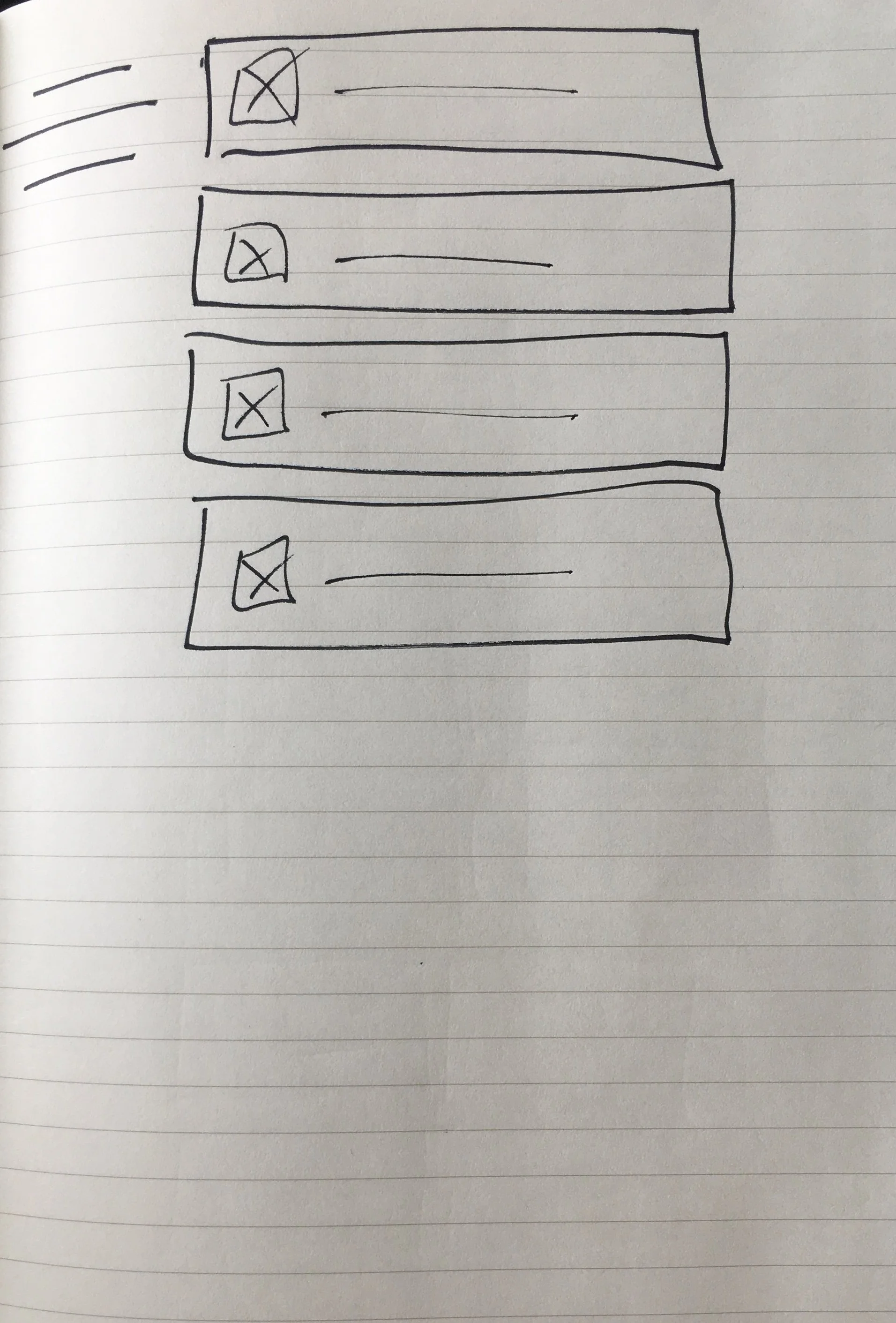
With a better idea of what to focus on for the next round of designs I would send to the stakeholders, I did some exploration on 3 different styles I had come up with. I decided to keep each one simple as far as what I would change for the next round but still send all 3 for review to see what examples the stakeholders liked the most. The basic differences between the designs at this point were the color fill of each section’s block of text and icons. One design I kept a solid fill like their original email example, one design I made a gradient with a transition to a lighter shade toward the top, and the final design was to round off the corners and have the border and text be the branded color but change the fill color to white.
To expand on the concepts, I made a few versions of each fill style with different icon placements and text justifications, to make sure I had all the bases covered for what might look best on an email in either desktop or mobile layout. With several iterations of each basic design completed, I sent visuals to the stakeholder team once again for another round of feedback and see which direction they were leaning and what style in particular would be the best fit going forward.


The feedback I received from the stakeholders at the end of this iterative design round was much more detailed and specific than any previous direction I’d gotten, so it was very clear where to go from there. I had expected to have a little more iteration to do and maybe another round of examples to deliver before getting an idea of the final design, but what I got in reply was basically an approval based on completion of a list of change requests.
The stakeholders liked the white blocks with colorful borders best, but wanted the corners squared off like the other 2 styles, so I made that change to the blocks. It was also decided that each block would have a few lines of descriptive text in addition to their titles, so in the end to have the mobile and desktop graphics be as congruent as possible, I changed the shape of the blocks back to squares which better fit the additional text requirements. The last 2 change requests were to have the header text be capitalized and center justified above the blocks, and to use a specific double-chevron character next to the title as an affordance for the user to know each block is clickable.
After making the requested changes I was able to send a finalized mockup and design spec to the stakeholder team, who approved and moved on to their development phase. The last email I received from my contact stated “They were delighted by the new designs and are incorporating them into all their new communications!”
Final Product


Overall, my favorite part about the final design was how it became a mix of the best parts of my design explorations for this project. Because I had put some time into making a few different directions to go at each step, the end result really did benefit from having a part of each of those options. Given some additional time, I believe there was even more room for improvement and refinement especially considering the fast pace the team was already on, but I would probably say that about any project I’ve been involved in at this point. What really matters is that the stakeholders were happy with the evolution of their product, and considering they had one person spending only a few hours on the design, I’m happy to have been able to contribute my work to the final result.
If, however, there was more time or budget for my design on the project, I had some idea of where I would spend my time. During my iterations I had proposed some motion design that would fit well with web-based interactions, but then realized the scope of my part of the design would be for email only, so I put a hold on any further motion or interaction design. Moving forward, due to the modularity and chunk-like nature of the blocks in the graphic, I could envision mocking up a lot of different interactions for them in prototypes. Since my work this time was focused on graphic assets and not prototypes, that will have to wait until next time.