

CLIENT
Squawk Metrics
The Team
Myself - UX, Visual, Interaction Design
Peter Moon - CEO
Lauren Broomall - Product Manager
Krishna Padisetty - CTO
Timeline
May 2015 - Jun 2016
My Deliverables
Logo design, brand development including font and color choices, interactive prototypes in Axure for testing and iterative refinement, visual design of final app visual artifacts and redlines in Adobe Illustrator provided to engineering team.
How Might We Improve Employee Engagement?
Employee engagement matters. Recent Gallup studies report that companies with high employee engagement outperform their competitors by 2.5 to 1 on an earnings per share basis. Yet, these same reports show that 70% of the US workforce is disengaged, which means that most companies have enormous untapped potential lying dormant in the workforce they already have.
Organizations that have accurate, timely, and meaningful measures of team health can identify teams and projects that are struggling to succeed long before other signs of failure appear. Knowing which teams are at risk allows leaders to take action early, while there is still time to address the underlying issues and improve outcomes. The vast majority of organizations struggle to assess team health and employee engagement, relying on periodic surveys and subjective manager assessments.
Mature companies recognize the importance of measurement, but more often than not, managers use performance metrics that conflict with customer goals, dis-incentivize collaboration, promote waste, and discourage innovation simply because they are available or easy to get. In a culture that prioritizes predictability and analysis above creativity and adaptability, managers are incentivized to choose metrics and targets that are under their exclusive control, without taking dependencies on other organizations.
The most important question is also one of the hardest to answer: "What metrics best reflect meaningful success for an enterprise?" Once identified, the next questions are, "How can we measure them effectively, and are their leading indicators that would can help us adjust our behavior while there is still time to impact our results?" The best approach is to start with metrics that seem suitable to a particular enterprise and adopt a process of successive approximation to improve them over time. Inevitably, optimizing one metric is possible, but often with unanticipated consequences.
Wouldn't it be great if we could identify a simple set of consistent metrics that would provide a meaningful measure of performance for any internal service provider? What if those metrics included leading indicators that we could measure continuously, so that we could take action to influence results? What if we could collect them without adding significant cost, employee grumbling, or cycle time? What if we could achieve increases in organizational performance of 2.5 times or more, in areas like collaboration, cycle time, business performance, employee retention, and satisfaction?
By Measuring What Matters
The Kiwi Dial system concept was born out of years of experience coaching teams to improve their performance in meaningful ways, identifying the need for a simple, pragmatic way to measure those improvements and learn what the most effective interventions are to achieve them. It is at once a coherent system optimized to fit a specific purpose, as well as a general approach that is applicable to a broad range of teams.
The system is designed to align the interest of stakeholders that are often at odds with each other, such as team members with their management chain, and between stakeholders and service providers. Instead of the traditional survey mechanism to gather insight, it is designed to provide direct benefits to users. The app was designed with the following goals:
Team members can see their opinions published for all to see, safely and anonymously
Team members can judge whether others might feel the same way as them
By making team sentiment broadly visible, team managers are more likely to address changes in team health
Stakeholders have a direct way of voicing their frustrations as well as their satisfaction, quickly and easily
Team managers have better, more timely data on the likely outcomes of their projects
Organizational leaders can aggregate team health and performance data to understand overall organizational performance and inform investments to improve performance
By providing reliable data, Kiwi Dials would give teams, managers, and companies the confidence to innovate, to try new ideas, or to go back to the basics, and know that they are making progress, all while reducing turnover costs and creating a more competitive, impactful workforce.
Research

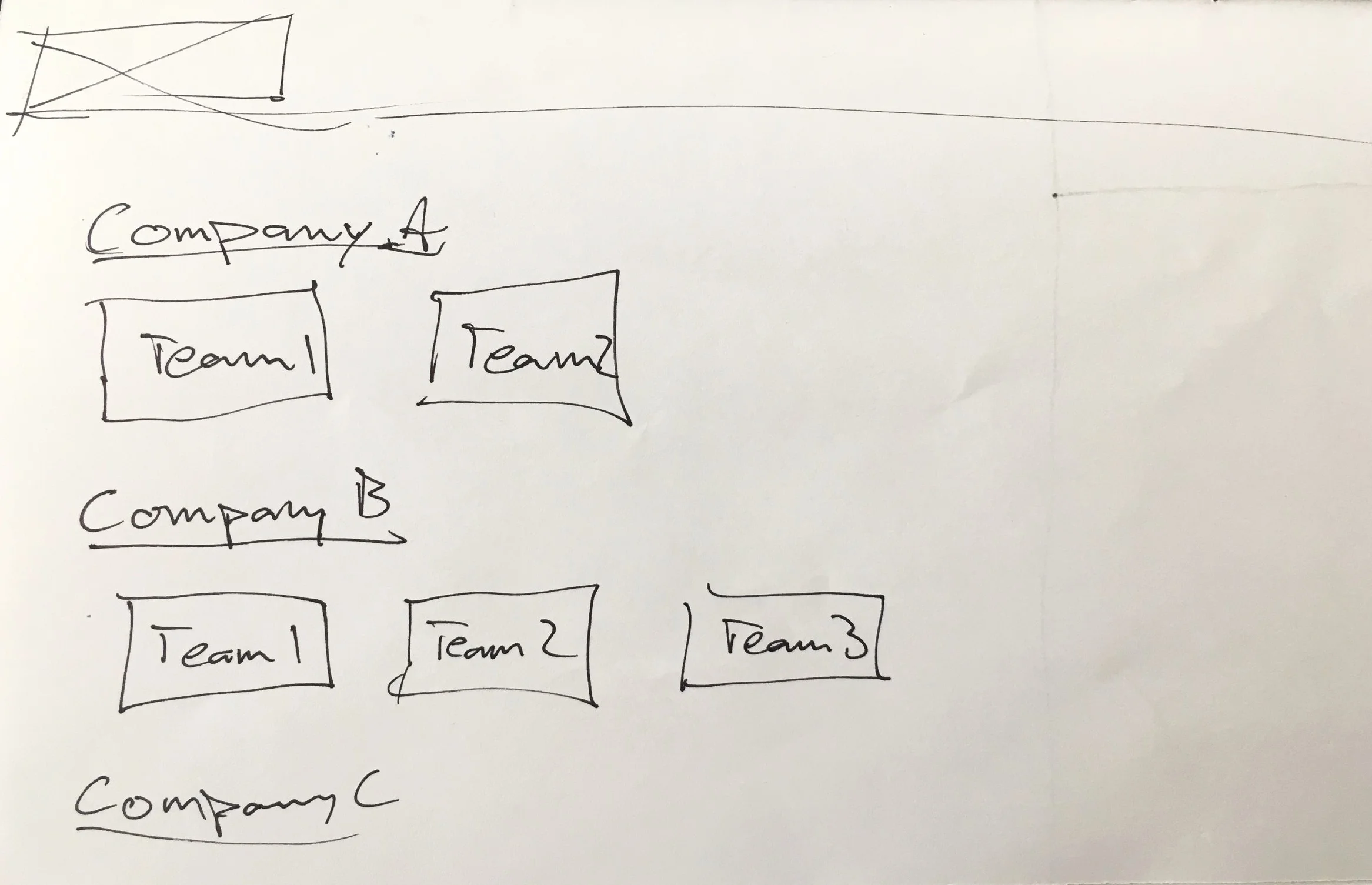
Kiwi Dials was designed from the outset to fill a specific role of measuring employee engagement safely, anonymously, quickly, and easily. From the start, a framework was adopted of associating engagement with seven main categories, some adapted from Daniel Pink’s Drive and others inspired by our own company’s work coaching teams. They are Autonomy, Mastery, Purpose, Recognition, Impact, Perception, and Social Connection. Each of those categories is made up of 3-5 metrics which contribute to a score for each main category, as well as an overall employee engagement score.
Insights

The first real Kiwi Dial was a physical one, able to be moved at any time by team members to measure certain specific aspects of their work. These metrics could be chosen by team members or managers to best measure their overall employee engagement. While useful and fitting for the intended outcome (giving employees a voice in measuring their own success) it was also stationary and so only could be moved when an employee was there in the room. What if they could do it at any time? What if they could remain anonymous so there wouldn’t be a fear of retaliation from management or team members? What if the data from everyone’s personal insight could be available to everyone? Those next questions are what the Kiwi Dials app would hope to address.
Ideation
Taking the concepts of both the physical Kiwi Dial and the metrics of employee engagement, I started sketching out some ideas of how to display them on a phone. I wanted to make sure it was simple to use and understand, but also keep the experience from becoming too serious or impersonal. There is a lot of data behind the dials and graphs which is very powerful, but could easily be overwhelming if displayed in a way that isn’t helpful to those trying to use it.
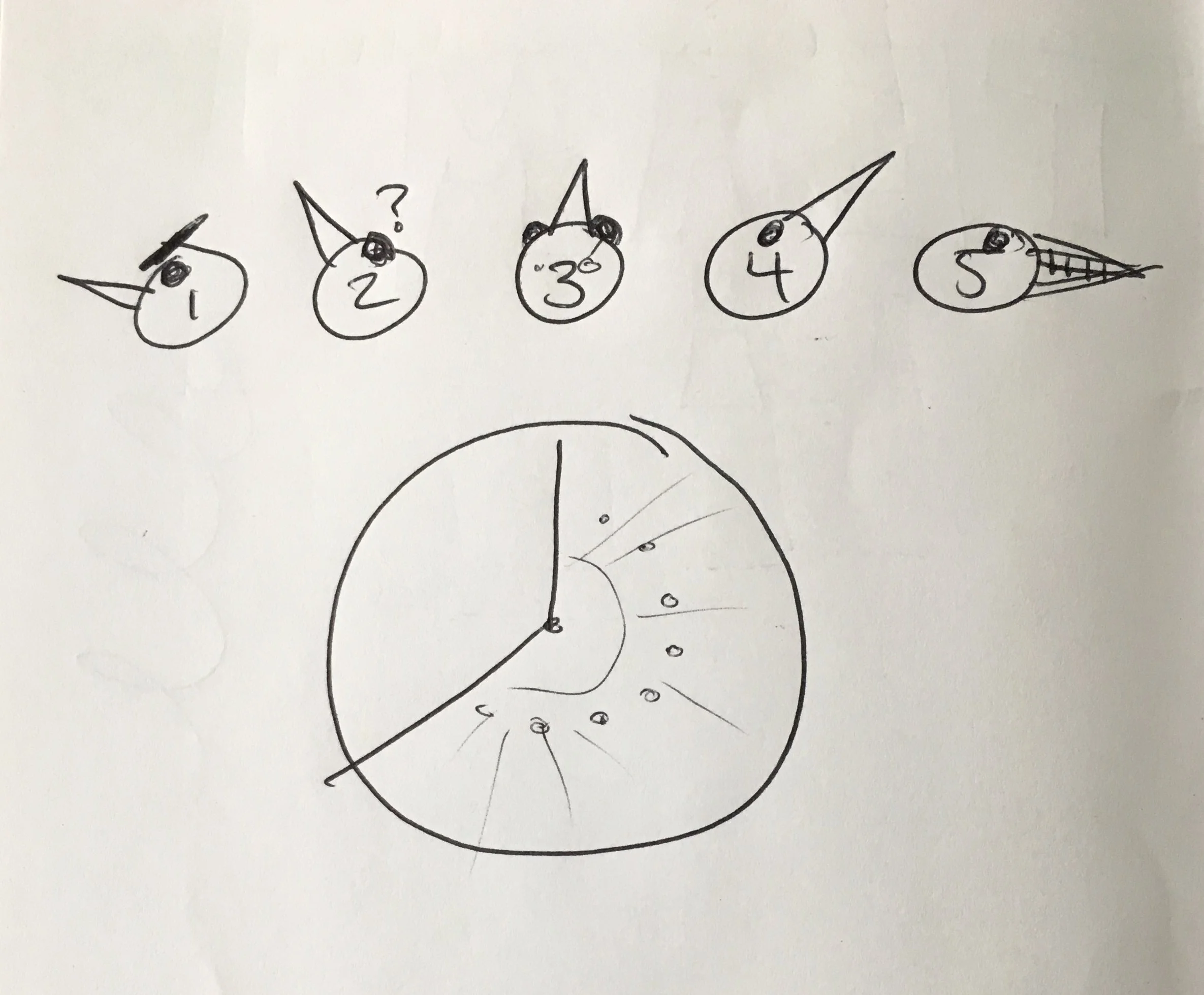
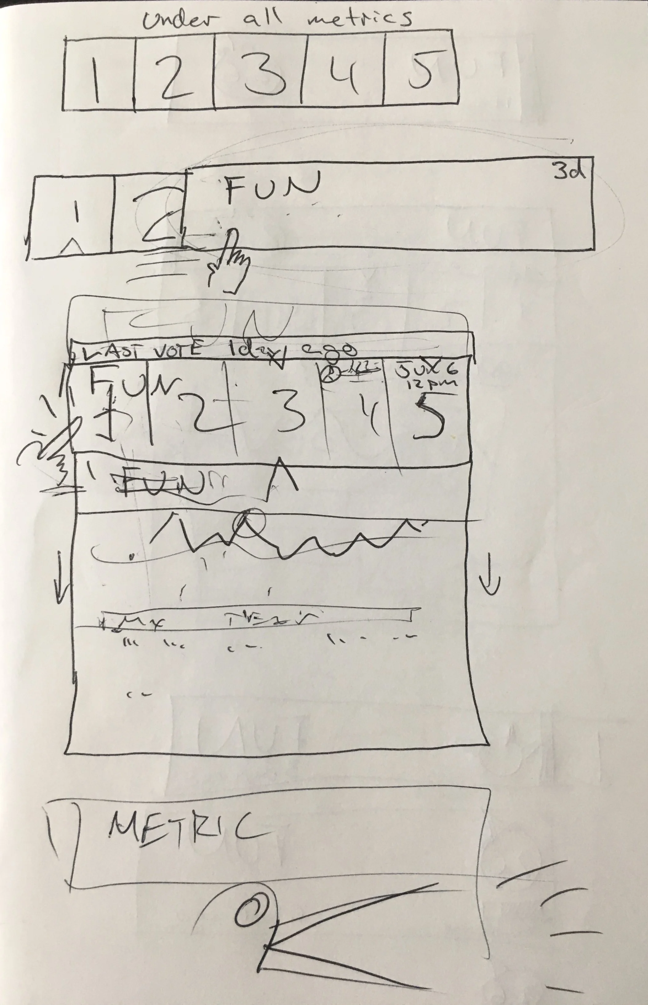


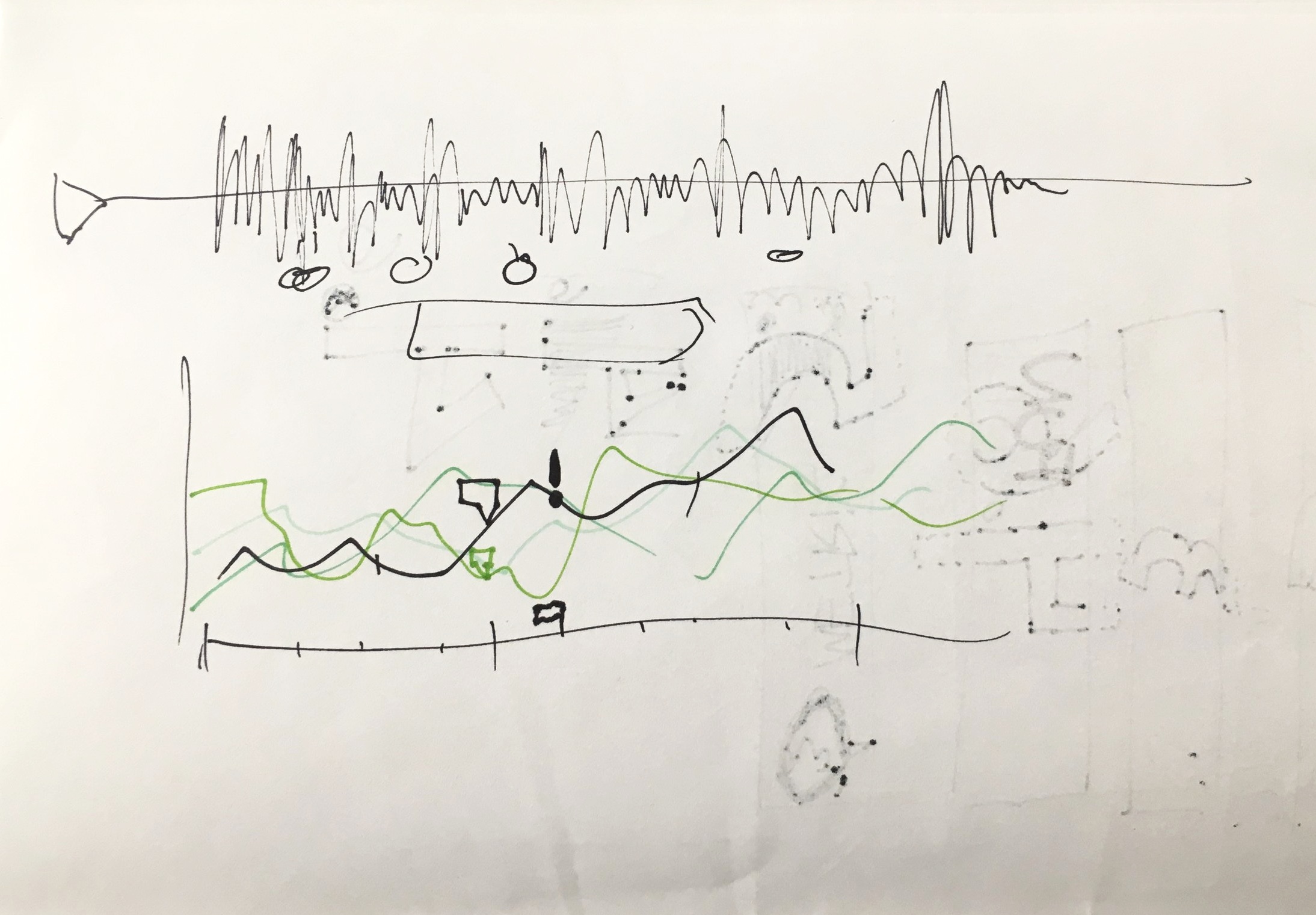
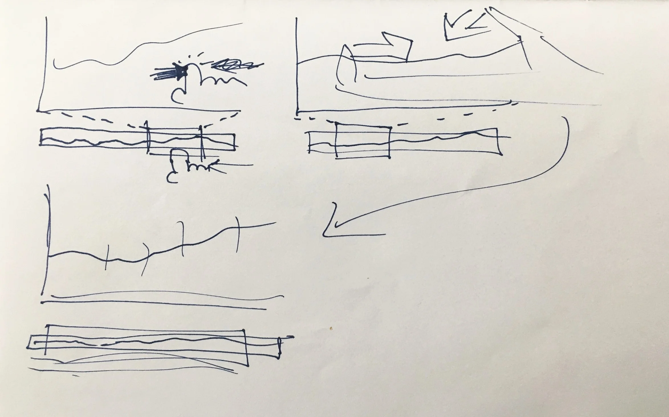
The first sketches I made are explorations of various UI ideas, as well as the concepts behind the data structure of how measuring employee engagement is achieved by the program.
Prototypes
I was tasked with drawing up prototypes for how an Android-based Kiwi Dial app might look, and using the principles of Material Design I was able to envision how the most important screens for a regular user would appear and interact. For the most part, these initial screens are very close to the first hand-drawn sketches, and were intended to be a more robust example of the direction Kiwi Dials would take.
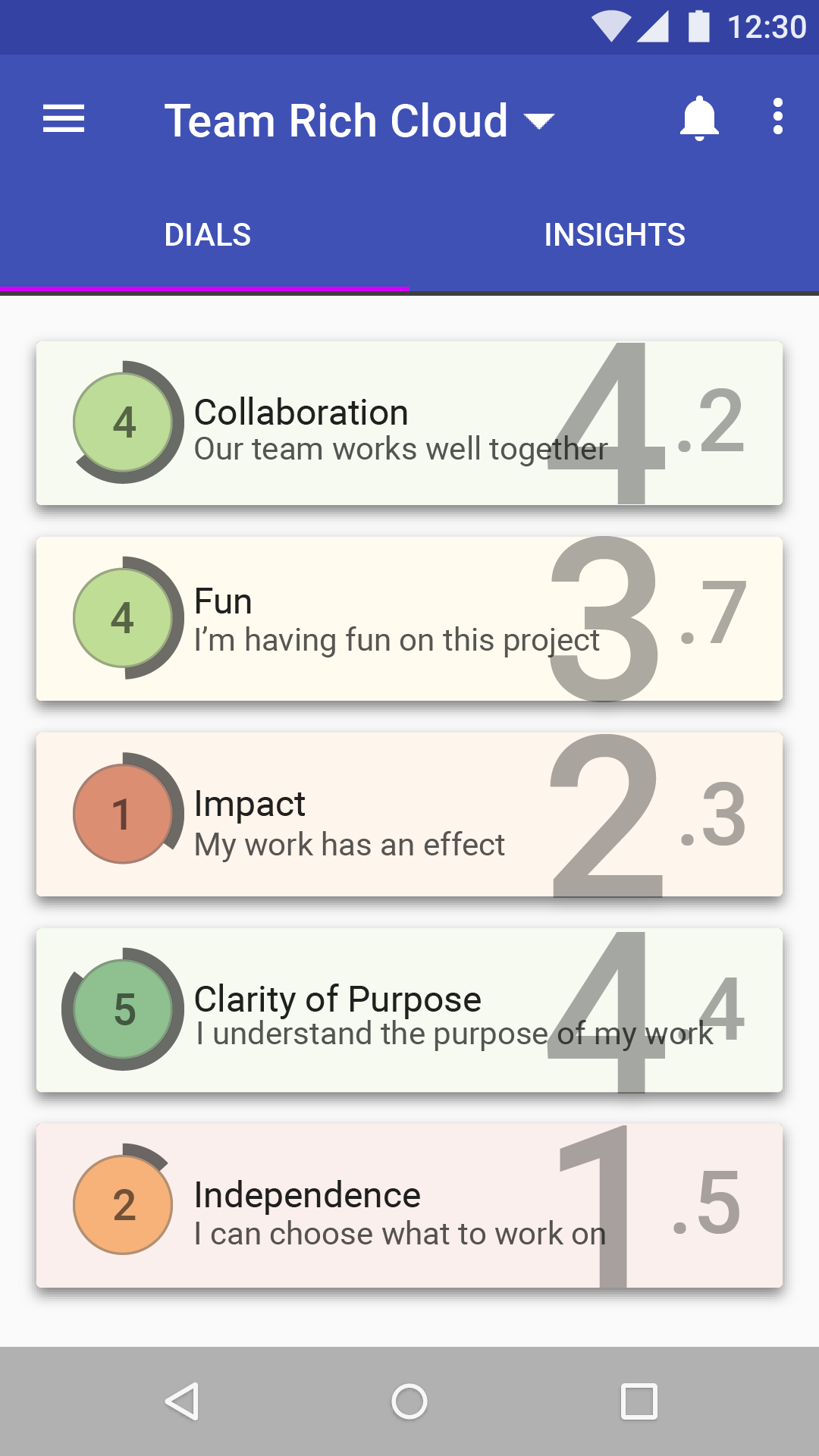


Having a middle ground between paper sketches and a working app prototype is useful in initial design stages, and using the framework specified by Google Material Design made it simple to have a relatively high amount of graphical fidelity while not requiring a new though process for a brand-specific UI initially. This allowed me to create a fairly large amount of screens rather quickly, and to share them with the entire team in a useful way since everyone could understand exactly what direction the design was leaning. Here are the initial screens designed for a user sign-up process.


I also was able to use standard Material Design interactions to represent how a lot of the other inner workings of Kiwi Dials would appear to the user, without the need for a high-fidelity clickable prototype in the early stages. Later on, I created an interactive prototype in Axure to display the core user interactions with the app, such as how each dial behaved and the overall flow of the user’s experience with them.


Further on in the process, my deliverables to the development team would contain a lot of redlines in order to make the reproduction in other platforms as consistent as possible. The following images are some of my redlines given to the engineers for the Windows Phone version of Kiwi Dials. A Windows Phone app was important to the stakeholders because due to the companies we were working with on partnering, a large percentage of the users would have had these phones at the time.


Final Product
At the conclusion of the design process, a lot of the visual representation and UI had remained the same, but refined for ease of viewing and use by all users in general. I had incorporated some of Edward Tufte’s work using Sparklines to simply represent certain aspects of the engagement components, and defined what a deeper look into those components would look like on a graph or timeline.


Along with the Android phone designs and the previously shown Windows Phone, I also translated the design into an iOS app for Apple products. This was created around the time iOS 8-9 was the standard, and of course would have to be evolved over the years as standards of design changed.


In the end, Kiwi Dials was released on Android, Windows Phone, and iOS, and continues to be used by savvy teams to this day with support from the engineering team. Kiwi Dials was the first app I participated in designing from conception to conclusion, and remains to be one of my favorite projects I’ve worked on thus far in my career.